Geolocation information gathered from the top 10 IP addresses probing the system
The following table displays the top 10 IP addresses connected to the system (ordered by volume of connections).
| ID | IP Address | Probes | City | Region | Country Name | Code | Latitude | Longitude | Hostname | IP Lookup | ||||||||
|---|---|---|---|---|---|---|---|---|---|---|---|---|---|---|---|---|---|---|
| 1 | 125.25.62.17 | 22270 | Lampang | Changwat Lampang | Thailand | TH | 18.19 | 99.3928 | node-c9d.pool-125-25.dynamic.totinternet.net |  | ||||||||
| 2 | 193.105.134.45 | 13503 | Sweden | SE | 59.3247 | 18.056 | 193.105.134.45 | | ||||||||||
| 3 | 195.3.147.47 | 13358 | Latvia | LV | 57 | 25 | 195.3.147.47 | | ||||||||||
| 4 | 31.30.120.136 | 12190 | Ostrava | Okres Ostrava-Mesto | Czechia | CZ | 49.8119 | 18.2553 | cst2-120-136.cust.vodafone.cz | | ||||||||
| 5 | 141.98.81.150 | 9079 | Panama | PA | 9 | -80 | 141.98.81.150 | | ||||||||||
| 6 | 141.98.81.138 | 8980 | Panama | PA | 9 | -80 | 141.98.81.138 | | ||||||||||
| 7 | 42.113.108.212 | 8021 | Vietnam | VN | 16 | 106 | 42.113.108.212 | | ||||||||||
| 8 | 141.98.81.154 | 7182 | Panama | PA | 9 | -80 | 141.98.81.154 | | ||||||||||
| 9 | 185.195.27.191 | 6494 | Russia | RU | 55.7386 | 37.6068 | biznet.spb.ru | | ||||||||||
| 10 | 185.244.173.44 | 5932 | Russia | RU | 55.7386 | 37.6068 | mail.rat-studio.ru | | ||||||||||
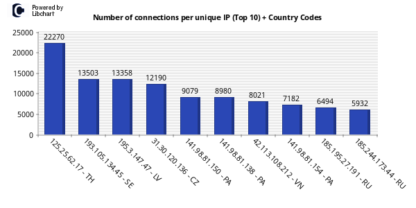
The following vertical bar chart visualizes the top 10 IPs ordered by the number of connections to the system.
Notice the two-letter country code to after each IP get a quick view of the locations where the attacks are coming from.
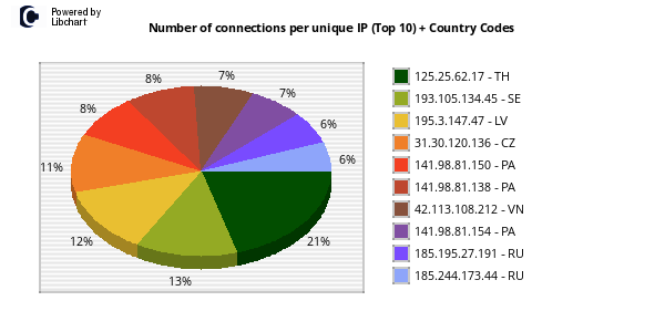
The following pie chart visualizes the top 10 IPs ordered by the number of connections to the system.
Notice the two-letter country code to after each IP get a quick view of the locations where the attacks are coming from.
The following zoomable world map marks the geographic locations of the top 10 IPs according to their latitude and longitude values. Click on them to get the full information available from the database.
The following Intensity Map shows the volume of attacks per country by summarising probes originating from the same nation, using the same IP or not.
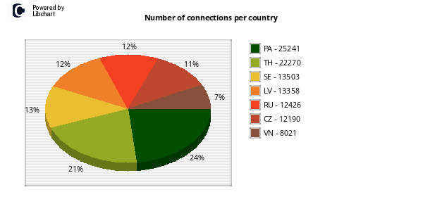
The following pie chart visualizes the volume of attacks per country by summarising probes originating from the same nation, using the same IP or not.
http://www.maxmind.com